Nutrition labels and fast food
Nutritional cues are a way of informing consumers about the nutritional content of products and potentially influencing fast-food purchasing decisions. The literature on nutritional information has implicitly assumed that these cues uniformly benefit consumers. However, we know that the application of nutritional cues by producers will often range from very elaborate and detailed displays of nutrition information, to entirely abstracted colored symbols. We argue that consumers reject health information when it is either overly detailed due to the increasing cognitive cost of redundant information, or when it is too abstracted due to a lack of context. We hypothesize that consumers will therefore make use of nutritional information when it demonstrates a sufficient trade-off between the depth of information provided, and the label's ease-of-use. We find support for these hypotheses, suggesting that producers may need to strike a delicate balance between overly complex and overly simplistic designs. Examples of real-world extremes (left and right) and a balanced example (center) are shown below. [Andrew Montandon & Chris Colli. British Food Journal, 2016] [Link]
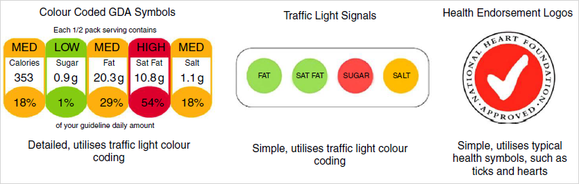
Range of nutritional labelling methods, evaluated in a fast-food context.